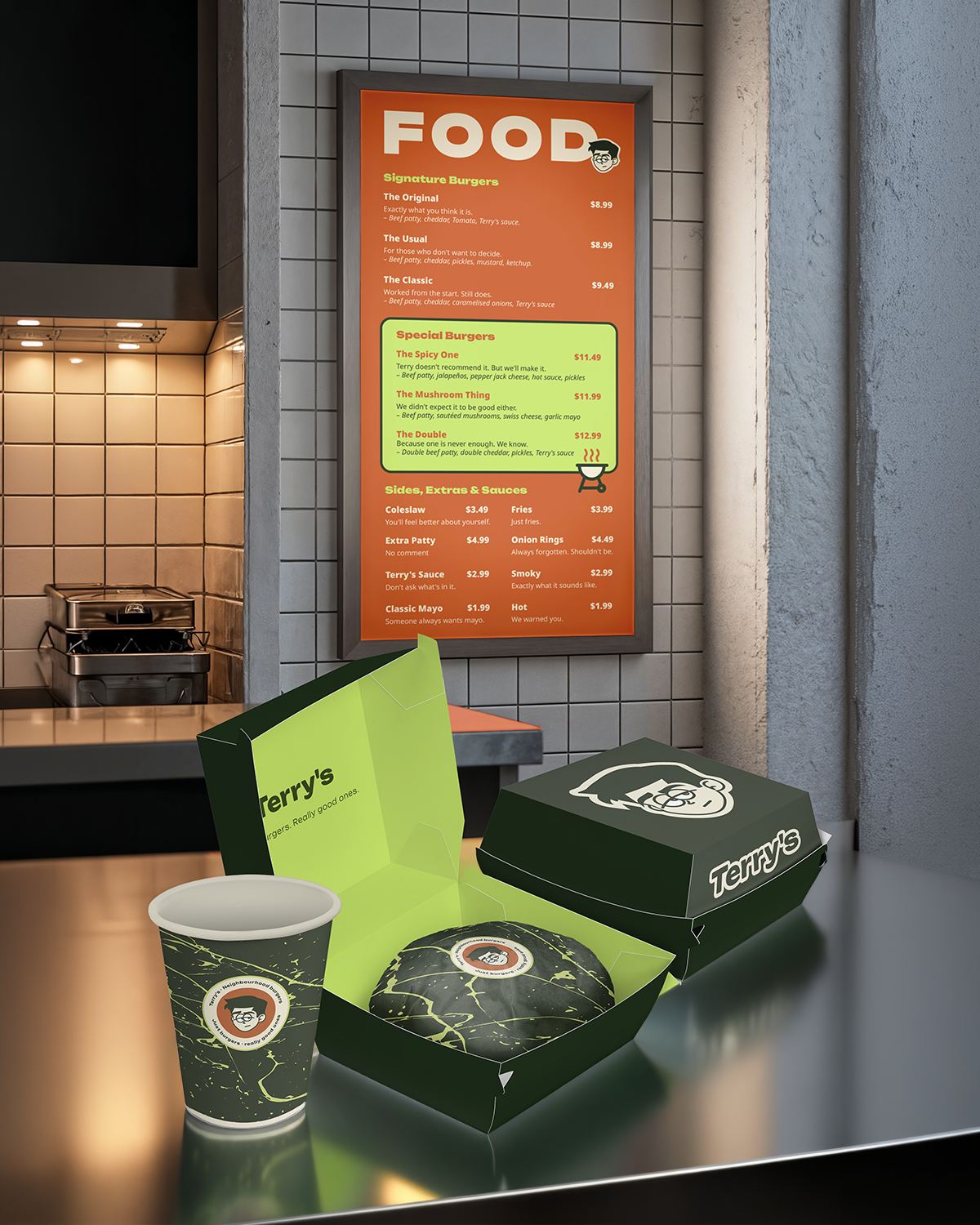
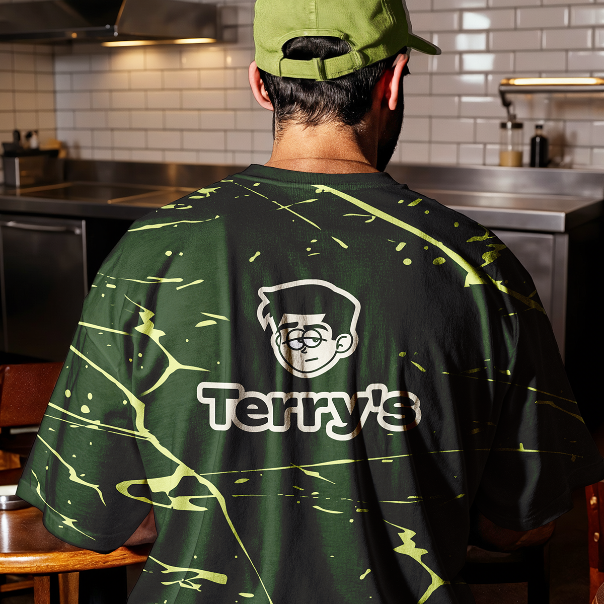
A concept brand identity for a neighbourhood smash burger joint that refuses to look like one. Terry's was built from strategy up with a deadpan mascot, a dark palette no one in the category uses, and copy that says less and means more.
Challenge:
The burger space is split between cheap chains using red and yellow, and overpriced "gourmet" spots trying too hard. Terry's needed to own a third space: graphic, confident, and completely unexpected for a food brand.
Strategy:
Built around one character. Terry is nobody special and that's exactly the point. The deadpan mascot became the vehicle for the brand's entire personality: unimpressed, consistent, quietly brilliant. Positioning: the neighbourhood burger that doesn't explain itself.
Logo:
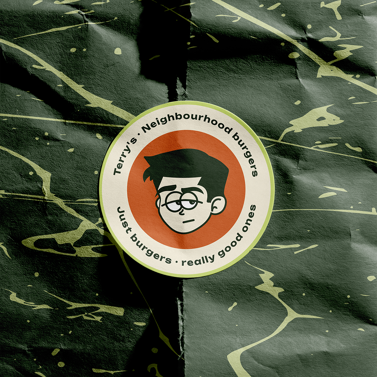
A five-variant logo system - primary stacked mark, circular seal, standalone mascot, wordmark, and sticker version. Each variant designed for a specific context, from packaging to embroidery to digital favicon.
Typography:
A rounded, friendly wordmark that balances Terry's dry personality. Bold enough to hold a menu board. Human enough to wear on a cap. Paired with a clean sans-serif for body copy and menu text.
Color System:
Deep forest green as the dominant - unusual in food, which is exactly the point. Electric lime for contrast and energy. Cream for warmth. Rust as a grounding accent.
No red and yellow together. No kraft brown. No flames.
Outcome:
Deep forest green as the dominant - unusual in food, which is exactly the point. Electric lime for contrast and energy. Cream for warmth. Rust as a grounding accent.
No red and yellow together. No kraft brown. No flames.